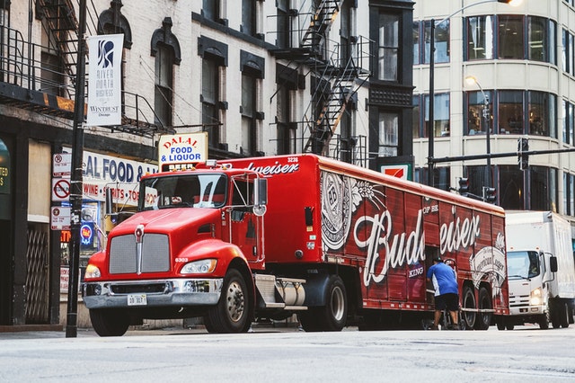
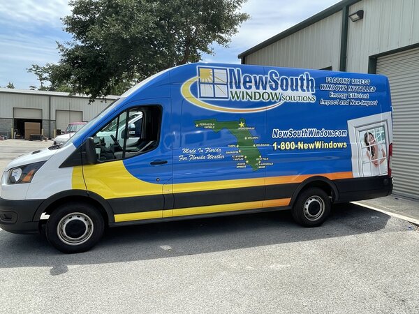
Wraps for a business’s commercial fleet are a great way to unlock advertising potential. The wide sides of cars, pickups, vans and trucks made them what is basically a roving billboard. That said, designing vehicle graphics is not as straightforward as designing a static billboard. Vehicles have contours, cuts and creases, all of which must be captured in the design. Keep reading to find the five definitive tips that will help you design effective automotive graphics every time.
Tip 1: Gather Information
Start not with the design but with an accurate template of the vehicle(s). You need to know your ‘canvas’ before creating designs, which means you need to know the dimensions and scale. Templates can be found online but it is best to ask your wrap printing (and probably installation) company for these. They may have particular software needs and not every file type is usable. Also, remember templates are approximations of the vehicle, different model years may have slight differences in the body shape, which may not reflect in the template.
Templates are useful but they may differ from your vehicle. Overlay your final design on a photograph of the actual vehicle to be sure.
Tip 2: Designing Vehicle Graphics
Once you have the dimensions, you can plan artwork around body lines, wheel wells, window openings, door handles and trim. Usually, designs are sketched out electronically on programs like Adobe Photoshop and Illustrator. The biggest advantage of this over sketching it out physically is that you can see the various elements of the vehicle on a computer screen, rather than draw by guesswork. Clients almost always prefer working with our designers at this stage because we are able to bring their concept to life – instead of them having to struggle with learning new software.
Tip 3: Overlay the Design on the Template and the Actual Vehicle
Test out the design on the template before finalizing it. Note very design that looks good on ‘paper’ looks good applied to the vehicle. It also pays to have a slightly larger than necessary design because it gives the designer leeway to tweak it according to the car’s shape. Once that is done, check it against an actual photograph of the vehicle. This is when you can really visualize if the advertising or branding message is bold enough and suits the vehicle.
Tip 4: Files for Printing
If you are working with the car graphic company’s own designers this shouldn’t be an issue, but make sure you save your design as a vector file. This allows scaling without loss in quality. Also, use a high pixel per inch (PPI) setting to ensure prints come out looking sharp. Finally, don’t forget to save the color space as CMYK.
Tip 5: Printing and Application
This is where, as the vehicle owner, you have to leave the automotive graphics up to the pros. Make sure you choose a well-known car wrap company in Kansas City, MO. We employ cutting-edge printing methods to ensure wraps are recreated faithfully. Our installers are experienced and apply wraps meticulously. We handle vehicle trim with care and make sure you are returned to a pristine vehicle.
Talk to Happy Signs and start designing your dream vehicle graphics today.
The post 5 Tips to Make it Right with Vehicle Wraps appeared first on Happy Signs.


