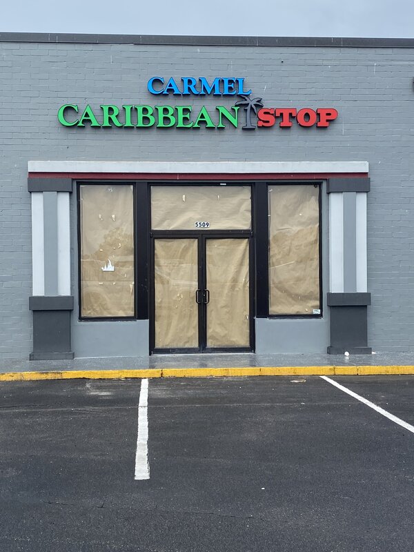
Do you enjoy admiring the stunning signs at Kansas City, MO, iconic businesses Dillard’s or the Avenues Mall? You’re looking at channel letters, everyone from Starbucks to McDonald’s uses these signs—and you should think about it for your business too.
Installing lighted channel letters isn’t enough; you need stunning designs that grab your client’s attention. In this blog, we’ll give you five tips and tricks to design effective signs.
Design Tip #1: Maximize the Size of Your Channel Letters
If you are uncertain about how large your signs should be, here’s the simple answer: as big as you can make them! Of course, you don’t want to make the sign too large for the space that it becomes uncomfortable for your customers but you want to be sure to maximize brand awareness.
At Happy Signs , you can Book a free, on-site consultation:
- to have us measure the space for your business signs
- Check to see if the sign will be obstructed by any objects.
- Receive a digital design mock-up to see how the sign will look before you finalize it.
Design Tip #2: Make the Most of the Lighting Options
Lighting is one of the key ingredients of effective custom channel letter signs. Luckily, you have many lighting configurations to choose from, such as front lighting, backlighting, spotlighting, and more.
Every option offers a distinctive look to the sign and the surrounding space, so choose wisely. The goal is to build a sign that reflects your business brand, enhances visibility, and makes your company stand out.
Design Tip #3: Mounting Styles Have a Big Impact
How a business sign is mounted to the building greatly affects its appearance and visibility. You can choose from a variety of mounts, including billboard-style roof mounts, raceway, floating, and hanging.
Each style offers a unique look, however, not all mounting options are available everywhere. The size of your sign, mounting surface, and other factors can affect which type you can use for your channel letters.
Design Tip #4: Fight the Over styling Temptation
Curvy fonts, complex design elements, and mood lighting sound appealing, but they don’t always work well. Swoopy cursive fonts can make it harder to read signs and understand your business name.
Discuss your designs with experienced designers to ensure you don’t end up with a sign that your customers can’t understand.
Design Tip #5: Don’t Forget Your Branding!
Branding is key, you’d be surprised at how often we receive design ideas from customers that don’t include any of their branding elements! Different logos, colors, and fonts. Make sure your lighted channel letters include your company branding elements so you can build brand awareness.
Work With the Channel Letter Gurus in Kansas City, MO
Happy Signs is the go-to signage partner for everyone from small businesses to large-scale businesses. We have a creative team that can design eye-catching channel letter signs to help you generate leads.
Book a free, on-site consultation with a professional at Happy Signs to discuss your needs. We’ll be happy to show you a catalog of stunning business signs that we’ve created and help you get started.
The post 5 Top Design Tips to Creating Business Signs From Channel Letters in Florida appeared first on Happy Signs .


